KEY OUTCOMES
80.3
Final SUS score — up from 30.4
0.2%
Error rate — down from 13%
40+
Design recommendations shipped
10+
New features introduced
Role
UX Designer & Researcher
Timeline
Dec 2020 - Apr 2021
Method
Contextual Inquiry
The Problem: Engineers Were Fighting the Tool Instead of Using It
PIDGraph is an AI-powered platform used by industrial engineers to digitize paper-based P&ID drawings. The AI converts hand-drawn technical drawings into accurate digital versions. But when the AI output was incomplete or incorrect, engineers had no efficient way to fix it manually.
The result: a platform with enormous potential actively frustrating its core users. My brief was to understand exactly where it was failing and design a solution that gave engineers back control.
What PIDGraph does
Engineers upload scanned P&ID drawings. The AI identifies and classifies piping symbols, instruments, and connections. Converting all into structured digital format.
Where it was failing
When the AI made errors, the manual correction workflow was slow, confusing, and error-prone. Engineers were losing trust in the output.
Starting With Evidence: Structured Heuristic Evaluation
Before speaking to any users, I conducted a thorough heuristic evaluation against Nielsen's 10 usability principles, benchmarked against three competitor tools. This built platform fluency and created stakeholder-ready evidence for why user research was necessary. This process also helped to structuring the protocol of Contextual Inquiry for later.
Heuristic #1 — Visibility of status
No clear feedback when AI processing was running, complete, or had failed.
Heuristic #3 — User control
No undo/redo for manual edits. A single mistake required restarting from scratch.
Heuristic #6 — Recognition not recall
Symbol library required engineers to remember codes rather than recognizing visual symbols.
Heuristic #4 — Consistency
Editing tools used different interaction models across different parts of the platform.
Heuristic #8 — Minimalist design
The interface surfaced all configuration options simultaneously, overwhelming engineers.
Heuristic #5 — Error prevention
No confirmation dialogs on destructive actions. Engineers could accidentally overwrite AI output.
High Severity
Medium Severity
Low Severity
Each area prototyped end-to-end
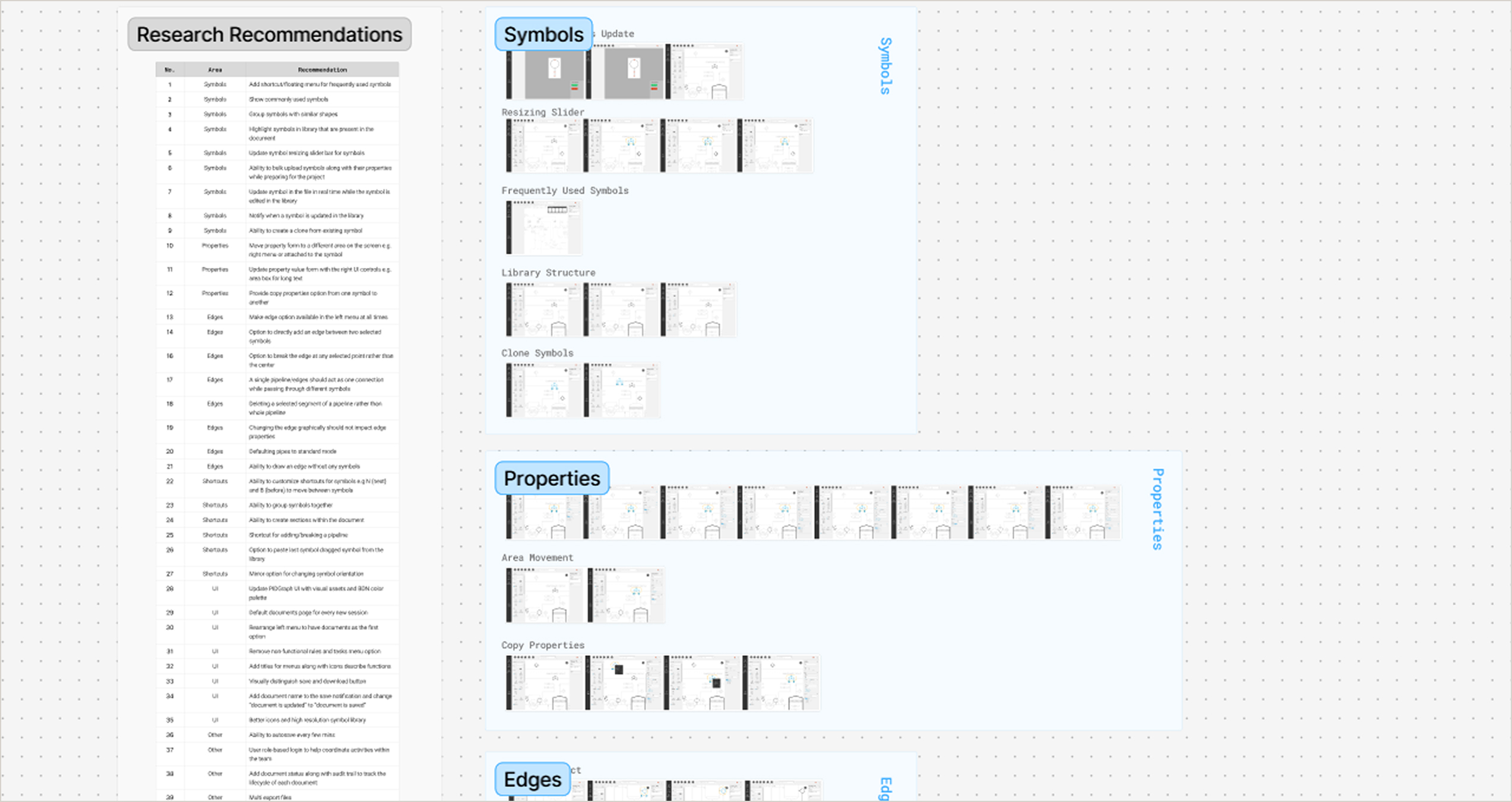
Each of the 6 areas was prototyped end-to-end before handoff. Below is the full output map — followed by three decisions where you can see the reasoning behind the design.

Prototype output map — 6 feature areas, 41 recommendations designed and prototyped
Four decisions where the research finding, design problem, and solution form a clear chain.
01
Symbols
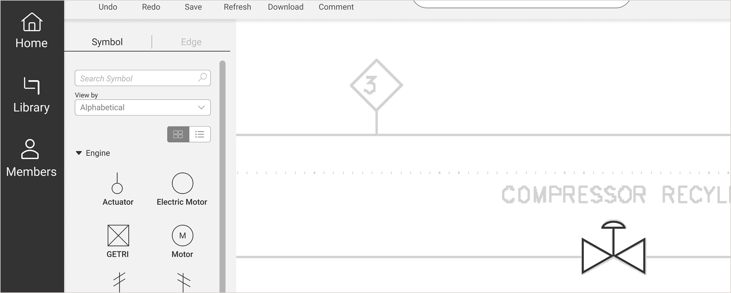
From code recall to visual recognition: redesigning how engineers find and place symbols
Research finding
Engineers navigated a text-only list of standardized industry codes with no visual preview. To identify any symbol, engineers cross-referenced a Teams document. Symbol placement is PIDGraph's most intensive interaction, and this repeated lookup added friction to every session.
→
Design problem
The symbol library required engineers to operate from memorized code knowledge rather than visual recognition. The absence of previews, search, and usage history meant that a highly repetitive core interaction offered no tool support, pushing the cognitive load entirely onto the user.
→
Solution
Visual previews replace code-only labels, grouped by category. Search enables lookup by name or code. A list view toggle preserves the familiar format. Sort by last used brings frequently placed symbols to the top, cutting navigation time across hundreds of placements per project.

Redesigned symbol library: visual grid, category grouping, search, list toggle, and sort by last used.
02
Properties
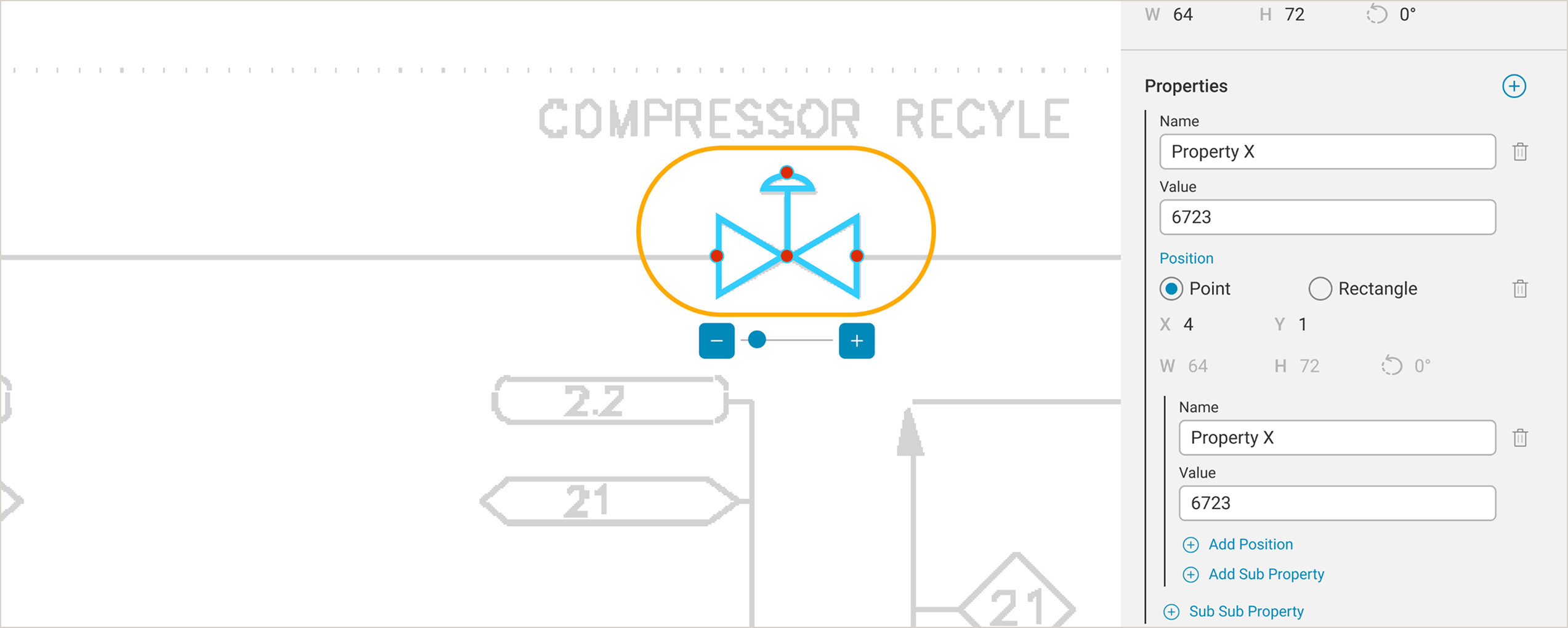
Clear hierarchy in a property panel that can grow without limit
Research finding
The original property panel was a flat list with no visual hierarchy. With dozens of properties and sub-properties per symbol, and potentially hundreds of symbols in one drawing, engineers had no reliable way to see which sub-property belonged to which parent.
→
Design problem
Without hierarchy, editing a specific sub-property required scanning an undifferentiated list. In engineering contexts where a wrong property change can cost thousands of euros, this navigation burden created serious error risk at scale.
→
Solution
A nested structure with left-border indentation groups each property with its sub-properties visually. Separate add actions make the level of addition explicit: the top-right button adds a main property, while inline links add sub or sub-sub properties at the correct depth.

Redesigned property panel with nested hierarchy, indentation grouping, and level-specific actions.
03
Edges
Auto-connection between two symbols using the background scan as a path guide
Research finding
Connecting symbols was done by manually tracing edges freehand across the drawing area. On a working zoom level that shows symbol detail, an A2-sized drawing extends far beyond the screen, forcing engineers to pan and trace hundreds of connections per session with minimal guidance.
→
Design problem
Manual edge drawing across a large drawing area is slow and error-prone at scale. With hundreds of connections required per session and a reference document already present in the background, the tool offered no way to leverage that existing information to assist the engineer.
→
Solution
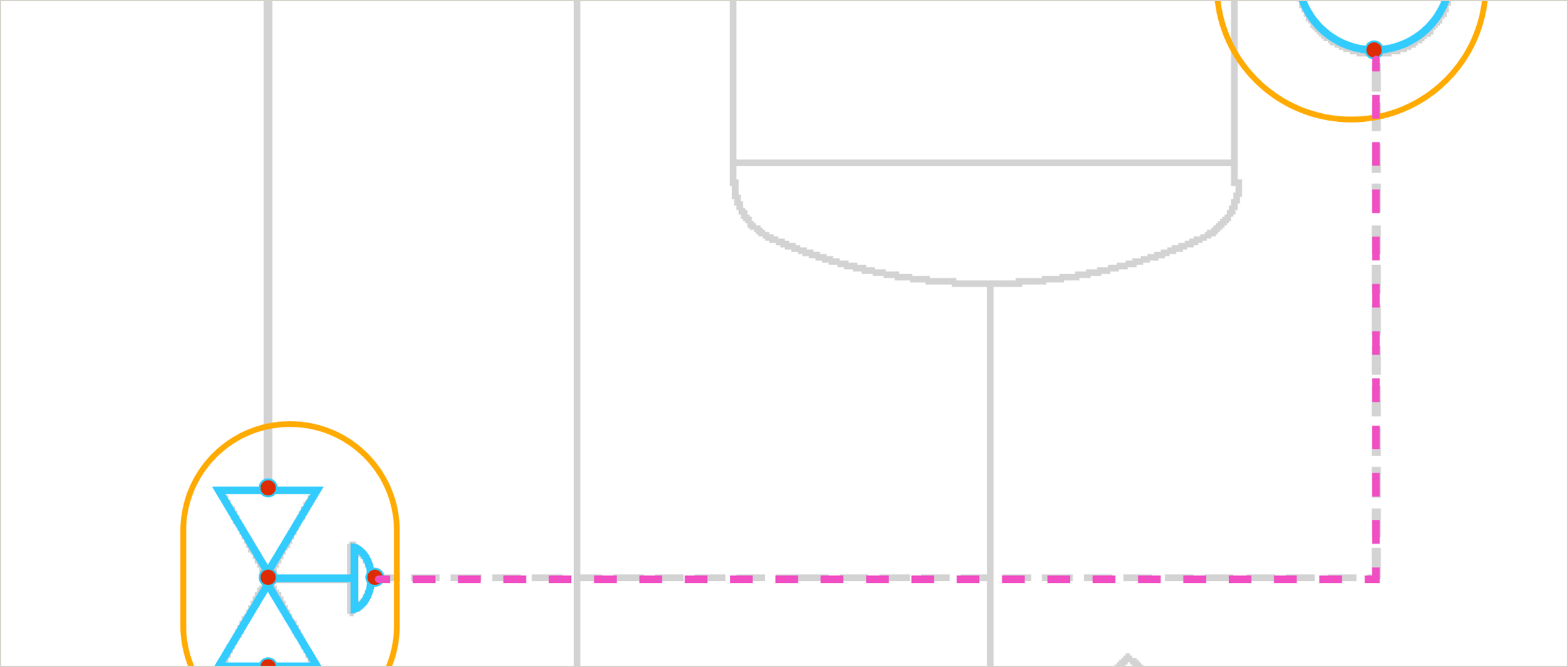
Selecting two symbols triggers PIDGraph to trace the background scan and detect a valid connection path. A pink dashed preview appears along the detected route. Pressing Enter confirms and converts it to a solid edge, reducing a multi-step manual trace to a two-click keyboard action.

Auto-connection preview: pink dashed path traced from background scan, confirmed with Enter.
Remote Contextual Inquiry: Watching Real Engineers in Their Real Environments
I chose remote contextual inquiry deliberately over lab-based usability testing. P&ID work is deeply context-dependent — engineers work with large second monitors and reference physical drawings alongside the digital tool. A decontextualized lab session would have missed half the story.
Method
Contextual inquiry
Participants
5 frequent users
Duration
1–2 hours each
Locations
Germany & Ukraine
Before — Baseline
SUS score
30.4
Error rate
13%
Total Errors
18
Average Severity
Medium
After — Post Redesign
SUS score
80.3
Error rate
0.2%
Total Errors
1
Average Severity
Low
Quantitative baseline vs post-redesign — same tasks, same five participants
Affinity mapping surfaced three dominant themes across all five participants:
Loss of trust in AI output
Engineers had learned to distrust the AI's classifications and were manually reviewing every element — even correct ones. The tool had no way to communicate its own confidence level.
Correction friction
Finding and fixing a single AI error required navigating 4–6 steps across disconnected parts of the UI. Engineers described the correction workflow as "hunting."
No recovery path
The absence of undo meant engineers were afraid to make edits. Several described working in a "read-only mindset" to avoid irreversible mistakes.
41 Design Changes Across 6 Areas
Research synthesis produced 41 specific design changes — each grounded in a finding from the audit or user sessions. Organized across 6 feature areas before handoff to engineering.
9
Symbols
Library, creation, real-time updates
8
Edges
Pipeline connections and drawing tools
3
Properties
Symbol metadata and copy controls
6
Shortcuts
Keyboard, grouping, section tools
8
UI Related
Navigation, notifications, visual system
7
Other
Autosave, roles management, export, audit trail
The prioritization of these 41 changes — deciding what shipped first and why — is documented separately as a methodology I now apply across projects.
DITRIX Case Study →
A second Round of Testing With the Same Participants and Same Tasks
The validation study used identical tasks, identical metrics, and the same five participants. Methodological consistency was deliberate, it's the only way to make before/after comparisons credible.
Method
Usability Testing
Participants
5 same cohort
Duration
1 hour each
Locations
Identical to baseline
Moving from SUS 30 to 80 means crossing from "unacceptable" to "excellent." 18 errors reduced to 1 — near-elimination of the failure modes identified in the audit.
SUS improvement
+163%
30.4 → 80.3
Error rate reduction
−98%
13% → 0.2%
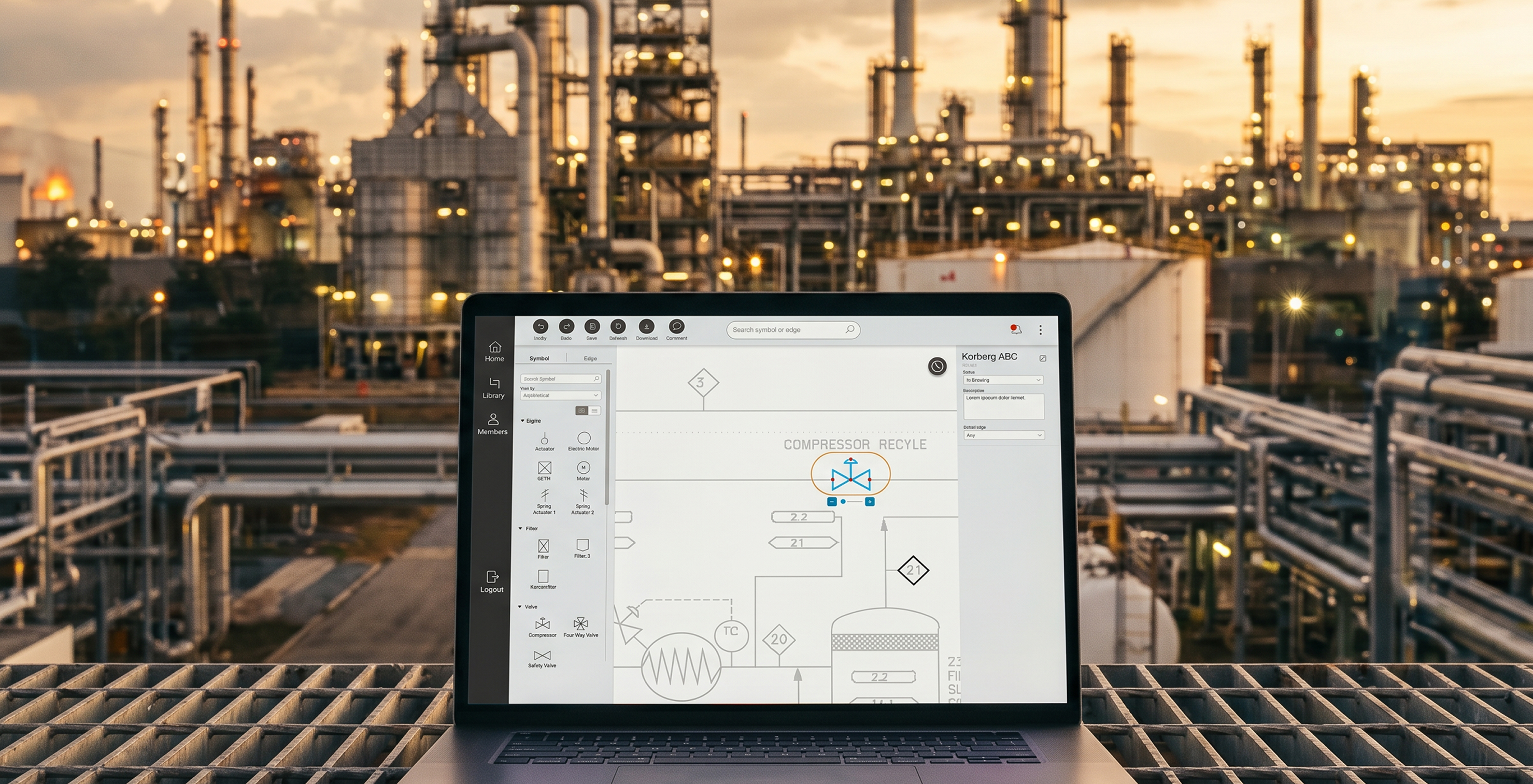
PIDGraph: Redesigning an AI-Powered Industrial Tool From Unusable to Excellent
A research-led UX improvement that took a platform engineers struggled to use (SUS 30.4 — "unacceptable") and transformed it into one they recommend (SUS 80.3 — "excellent") through rigorous audit, remote contextual inquiry, and 40+ targeted design changes.
What This Project Taught Me
01
Sequence research to build organizational trust, not just to gather data
Starting with the audit — before asking for user research budget — gave me credible evidence to justify the investment. This sequencing is a stakeholder management decision as much as a research one.
02
Context matters more than quantity in expert user research
Five engineers in their real working environments told a richer story than a larger lab sample would have. Remote contextual inquiry was the right method for this user group, not the convenient one.
03
The biggest UX fix is sometimes the most obvious missing feature
Undo/redo is table stakes in any editing tool. Its absence had created a cascading anxiety affecting every interaction. Sometimes the right insight from research is embarrassingly simple — that's exactly why you do the research.
Michael Gibran
Senior Product Designer
Berlin, Germany
© 2026 Michael Gibran