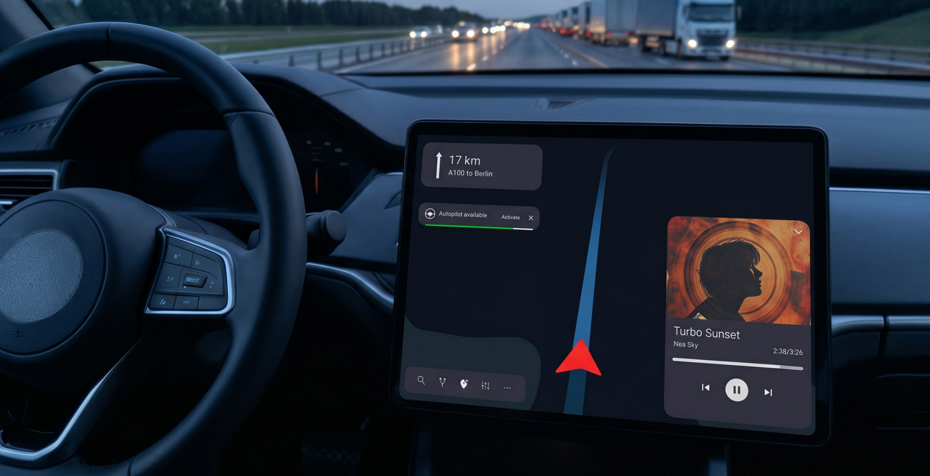
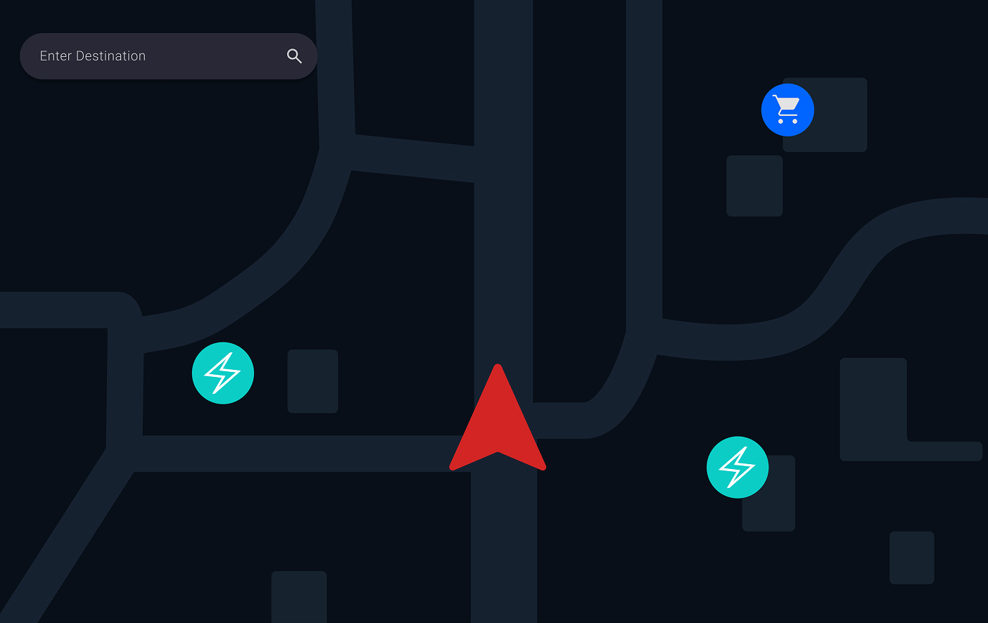
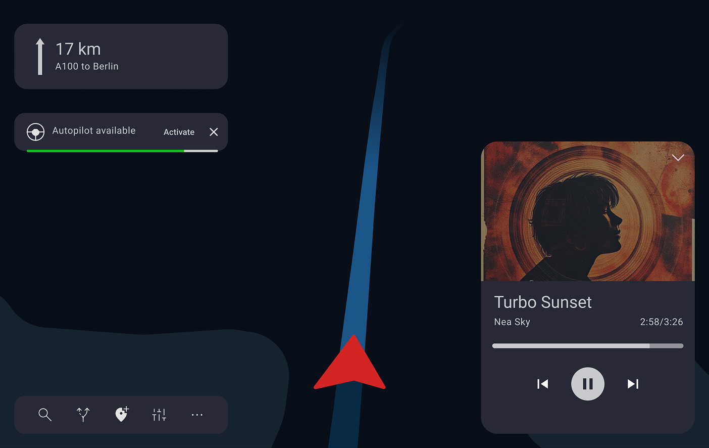
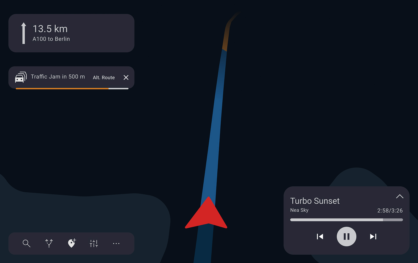
Designing at Scale: HMI for the Next Generation of Volkswagen Group Vehicles

How I helped shape navigation and ADAS experiences across multiple brands within Volkswagen Group, balancing safety regulations, brand identity, and real-world driver behaviour.

In-Car Infotainment System — Volkswagen Group HMI
Role
UX Designer
Timeline
Nov 2022 – Mar 2025
Focus Area
Navigation and Driving Assistance

Project Complexity

CARIAD is the software entity behind the Volkswagen Group's unified vehicle operating system, responsible for a platform that ships across brands with distinct identities and user bases. My work covered two tracks with very different starting points.

Navigation HMI
Routing interactions
Settings architecture
Multi-brand adaptation
ADAS Experience
Future HMI Concepts
Common design system
Safety-first interaction models
Shared constraint: patterns must scale across multiple VW Group brands

Structural diagram: Two-stream project scope

It Was Organizational, Not Just Design

The central tension: the same feature had to work across brands with legitimately different requirements. My ownership covered routing and settings — two areas where brand conflicts were most acute.

Brand A
Established routing confirmation flow users are familiar with
Brand B
Different model matching brand UX philosophy
Resolution: one interaction logic, brand-level surface adaptation

How I Navigate Complex Multi-Stakeholder Work

Rather than jumping to screens, I started with behaviour, understanding how drivers interact with routing in real use. For ADAS, close collaboration with engineering was essential before any concept could be designed.

01
Behavioural research
Existing + competitor benchmarking
02
Alignment workshops
Structured negotiation across brands
03
Interaction design
Within safety and brand constraints
04
Usability validation
Iterative testing and spec handoff

Process flow: End-to-end from discovery to handoff

Safety and Regulation
Distraction guidelines
ADAS level constraints
Legal requirements
Brand Requirements
Visual identity
Interaction philosophy
User familiarity
Engineering Feasibility
Technical constraints
Platform capabilities
Scalability
Shared abstraction: interaction pattern satisfying all three layers simultaneously

Decision framework: How each design decision was evaluated

Worked Example: Navigation Re-Routing

To make the design reasoning concrete, here is a simplified reconstruction of one feature I worked on — the flow that takes a driver from a live traffic alert to an accepted alternative route. The visual style and interaction details differ from the production version, in line with what I can share publicly.

Reconstructed for public sharing
This feature is inspired by production work at CARIAD / Volkswagen Group. Aspect ratio, visual language, and certain interaction details have been deliberately changed for NDA purpose. The overall design logic and flow structure reflect my actual approach.
Persona
Rossa, 34 — daily commuter, Berlin
Rossa is heading to her favourite restaurant on the other side of Berlin. During the drive, the car assists with most driving tasks. Since she dislikes traffic, she expects the car to keep her informed in real time — helping her avoid congestion and suggesting alternative routes for a smooth journey.
User Flow
01
Select destination
02
Start driving
03
Self-driving available
04
Traffic detected ahead
05
Reroute
Screens Overview
Linear flow: Default, Destination found, Self-Driving transition, Traffic ahead
1. Start Screen
Start Screen — default navigation state
2. Destination Found
Destination Found — route confirmed
3. Self-Driving Mode
Self-Driving Mode transition
4. Traffic Detected Ahead
Traffic Detected Ahead — alert state
Branch states: Alternative Route Auto and Self-Driving Setting
5. Alternative Route Timeout
Alternative Route — auto-select timeout state
6. Self-Driving Setting
Self-Driving Setting — autopilot preferences
Design decisions
Traffic alert as a non-blocking interrupt
The alert sits at the top of the screen without pausing the active route or music. The driver stays in control — the system informs, not interrupts. This was driven by safety research showing that full-screen takeovers increase reaction time.
Alternative route shown before acceptance
The map previews the alternative before the driver commits. The difference in time and distance is shown immediately, not buried in a confirmation dialog. Reduces cognitive load at the moment of decision.
Autopilot preferences separated from the flow
Autopilot configuration is accessible from the reroute screen but not forced. The driver can accept the route without changing autopilot settings. Keeps the primary task — accepting a route — uncluttered.

Deployed in Production Vehicles

The navigation features I contributed to are now deployed in production vehicles on the road in North America and Europe across multiple VW Group models.

200+
Screens harmonized and aligned across brands
2
Markets deployed: North America and Europe
2
Parallel tracks: navigation iteration and ADAS greenfield
2.5yr
End-to-end from discovery to production delivery
North America
US CA
Europe
DE FR ES CZ

What This Project Taught Me

01
In safety-critical design, clarity beats cleverness
Every time I was tempted toward a novel interaction, the question of what happens if the driver misunderstands this at 120km/h brought me back to fundamentals. Simplicity is not a compromise — it is the goal.
02
Alignment is a design deliverable
A decision that everyone can act on is worth more than a perfect design nobody implements. Treating workshops and documentation as design outputs changed how I measure my own impact.
03
Designing once for many is a different skill
Creating interaction patterns that scale across brands with different identities and engineering stacks requires abstraction that single-product design does not demand.
← Previous case
Smart Factory Dashboards
Bilfinger
Next case →
PIDGraph Redesign
Bilfinger